Motion With Care Unlocking accessibility: an introduction to @prefers-reduced-motion in web design


Accommodating the accessibility settings that people make on their devices is very important for modern websites. Browsers are improving and offering powerful features to help us developers take advantage of these preferences. Just as we can check someone’s preferred color scheme with prefers-color-scheme, we can check if they want to see animation and motion or skip it with prefers-reduced-motion.
Motion and animation on the web
Animations are often used to provide visual feedback, such as letting you know that data is being processed or that an action has been completed. Moving elements on websites can also affect how we perceive things. For example, a loading animation that plays while the actual content is loading can make it seem like the page is loading faster.
There are also decorative effects such as animated color gradients, parallax scrolling, zoom effects, background videos, and more. Ideally, animations enhance the user experience by making a static page more interactive.
Problems with moving elements
But here’s the thing: many websites bombard their visitors with animations that start automatically, drain your device’s battery, and use a lot of resources. While some people enjoy these animations, others find them distracting, slowing down their browsing experience, or feeling restricted by them. In the worst cases, animated content can even cause health problems such as difficulty concentrating or nausea. That’s why it’s important to give people control over animation on the web.
Fortunately, many OS have an accessibility setting to reduce motion. By using the prefers-reduced-motion media query, we can check to see if this option is enabled and adjust the amount and type of animation accordingly.
prefers-reduced-motion in CSS
Now let’s dive into the CSS part. For the prefers-reduced-motion media query, there are two values: no-preference and reduce. If no value is specified, the query evaluates to true, so we don’t necessarily need to use the reduce value. However, it’s good practice to explicitly specify it to make the code more readable:
// Media query when the reduced motion feature is turned on
@media screen and (prefers-reduced-motion: reduce) {
    ...
}

// Works as well
@media screen and (prefers-reduced-motion) {
    ...
}

// Media query when the reduced motion feature is turned off
@media screen and (prefers-reduced-motion: no-preference) {
    ...
}
Let’s say we want to draw attention to an important submit button with a compelling animation. For people who prefer not to see animation, we can simply deliver the same button without any animation using the prefers-reduced-motion media query:
button {
    animation: fancy-animation 0.2s linear infinite both;
}

@media (prefers-reduced-motion: reduce) {
    button {
        animation: none;
    }
}
Here’s another cool trick: by combining CSS custom properties with the prefers-reduced-motion flag, we can do even more. We can define a variable like var(–animation-duration) and set it to 200 milliseconds. At the same time, we create a @media (prefers-reduced-motion: reduce) rule that sets this variable to 0 milliseconds, effectively disabling animations and transitions. We can then use this custom property in all animation and transition properties. As a bonus, even the scrolling motion can be reduced if desired.
// Set the custom properties by considering the prefers-reduced-motion flag
:root {
    --animation-duration: 0.2s;
    --scroll-behavior: smooth;

    @media (prefers-reduced-motion: reduce) {
        --animation-duration: 0s;
        --scroll-behavior: auto;
    }
}

// Use the custom properties
* {
    scroll-behavior: var(--scroll-behavior);
}

button {
    animation: fancy-animation var(--animation-duration) linear infinite both;
}
If your CSS code includes extensive animation, it may be a good idea to put it in a separate stylesheet that is loaded conditionally using the media attribute on the link tag. This way, we can reduce the amount of data and therefore load time for people who prefer reduced motion when browsing a site:
<link rel="stylesheet" href="fancy-animations.css" media="(prefers-reduced-motion: no-preference)">Use in JavaScript
Finally, let’s talk about using prefers-reduced-motion in JavaScript. Just like any other media query, we can check and validate it accordingly. This gives us the flexibility to dynamically run, stop, or start actions based on user preferences:
/**
 * Checks if the user prefers reduced motion and returns a boolean value.
 * @returns {boolean} - True if the user prefers reduced motion, false otherwise.
 */
const checkReducedMotion = () => {
    const mediaQuery = window.matchMedia('(prefers-reduced-motion: reduce)')

    return mediaQuery?.matches
}

if (checkReducedMotion()) {
    // some code WITHOUT animation
} else {
    // some code WITH animation
}
Browser support
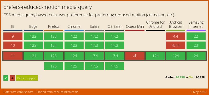
prefers-reduced-motion is supported by all modern browsers. To learn more about browser support for this feature, you can visit caniuse.com for even more detailed information:
Hero image: Generated with google/imagen-4 on June 20, 2025 at 3:51 PM.